
THE HISTORY OF WESTERN CALLIGRAPHY
The historiography of Western calligraphy is very closely associated with Romans and Athens-The two great ancient powers of the Western world. They developed the first scripts that was easy to use. With time, the Romans also started to get creative with their alphabet and script, using a more cursive style of writing. However, their letters were still clearer and simpler to read, compared to the Christian monks who used more complex style of writing to decorate the Bible.
Unicial:
The Uncial script developed in the second or third century AD, influenced by the Greek alphabet. This script is characterised by bold and curved strokes, and was simpler than the Roman capitals, allowing for speedier writing, ideal for copying manuscripts such as holy scriptures. Christian churches promoted the development of this writing through prolific copying of the Bible and other sacred texts.
Caronlingan:
Variations of the Uncial scripts developed as its influence travelled to other parts of Europe. An important script of the medieval era was the Carolingan script developed during the reign of Charlemagne in the late 8th century. While in England, the Insular script developed and spread across England and continental Europe.
Gothic:
Around the 12th century, the Gothic script developed in northern Europe from the Carolingian hand. This style, characterised by compressed thick, angular strokes and shapes, is very popular today and different variations of it are practiced by calligraphers. Among the variations are Textura, Lombardic Capitals, Batarde and Fraktur.
Italian & Humanist:
In Italy, however, the Gothic script was considered rather unpractical and fatiguing to the eye. Thus the Humanist minuscule was favoured. This script was influenced by the Caronlingian hand and arose around the 15th century.
Foundation:
At the start of the 20th century, Edward Johnston rediscovered how the formal bookhands of the ancient illuminated manuscripts had been written using square cut quills which produced thick and think strokes with even pressure. Johnston advocated that developing an upright roundhand was an essential. Thereafter, the penman can adapt and develop it to a sloping or angular hand with ease.
Roundhand & Copperplate:
During the 17th and 18th centuries, English writing masters Geroge Bickham, George Shelley and Charles Snell popularised Roundhand's popularity, so that by the mid-18th century this style had spread across Europe and crossed the Atlantic to North America.
Also in the 18th century, the development of metal plate-engraving and the rise of a business class gave rise to the importance of the Copperplate script.
WESTERN ALPHABET
Rustic capitals:
Uncial's rounded form owes something to the Greek alphabet, and historically it's associated with the early Christian Church. It superficially resembles traditional Irish scripts (Irish/Insular Majuscule). In one form or another, it was used in handwritten books for nearly a millennium. For much of that time it was strictly a calligraphy alphabet (rather than a historical script) in that it was written out slowly and painstakingly to look as impressive as possible.
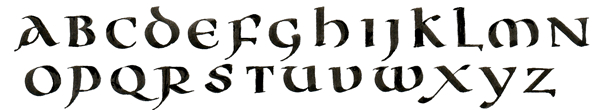
Rustic capitals are similar to Roman square capitals, but are less rigid, influenced more by pen and ink writing on papyrus or parchment. The letters are thinner and more compressed, use many more curved lines than do square capitals, and have descenders extending below the baseline.
Uncial script:
In general, there are some common features of uncial script:
⟨f⟩, ⟨i⟩, ⟨p⟩, ⟨s⟩, ⟨t⟩ are relatively narrow.
⟨m⟩, ⟨n⟩ and ⟨u⟩ are relatively broad; ⟨m⟩ is formed with curved strokes (although a straight first stroke may indicate an early script), and ⟨n⟩ is written as ⟨ɴ⟩ to distinguish it from ⟨r⟩ and ⟨s⟩.
⟨e⟩ is formed with a curved stroke, and its arm (or hasta) does not connect with the top curve; the height of the arm can also indicate the age of the script (written in a high position, the script is probably early, while an arm written closer to the middle of the curve may indicate a later script).
⟨l⟩ has a small base, not extending to the right to connect with the next letter.
⟨r⟩ has a long, curved shoulder ⟨ꞃ⟩, often connecting with the next letter.
⟨s⟩ resembles (and is the ancestor of) the "long s" ⟨ſ⟩; in uncial it ⟨ꞅ⟩ looks more like ⟨r⟩ than ⟨f⟩.
In later uncial scripts, the letters are sometimes drawn haphazardly; for example, ⟨ll⟩ runs together at the baseline, bows (for example in ⟨b⟩, ⟨p⟩, ⟨r⟩) do not entirely curve in to touch their stems, and the script is generally not written as cleanly as previously.
1.Rustic capitals
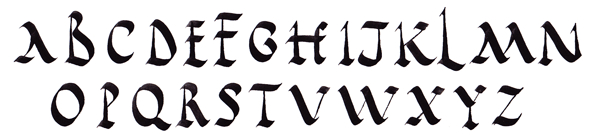
2.Uncial script
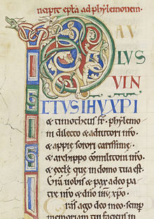
First page of Paul's epistle to Philemon in the Rochester Bible (12th century)
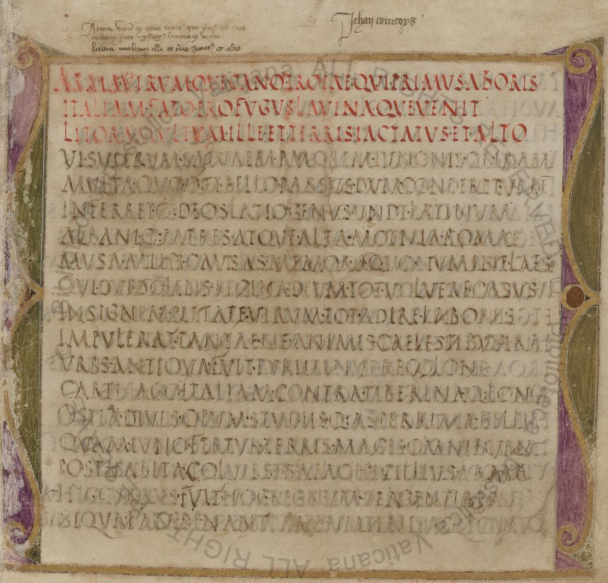
Page of the Virgilius Romanus (5th century)
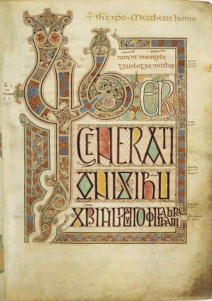
Lindisfarne Gospels (c.700) contains the incipit from the Gospel of Matthew
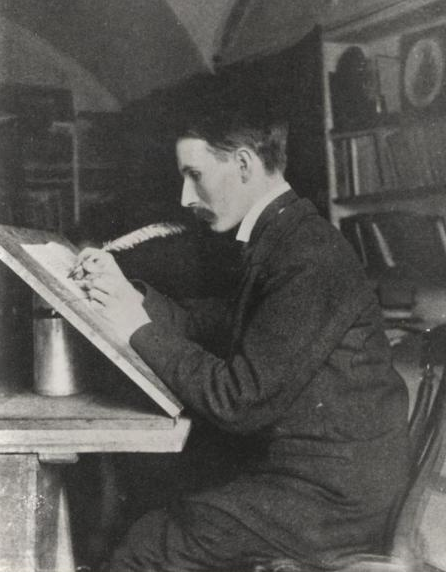
Edward Johnston, founder of modern calligraphy, at work in 1902