WHAT IS CALLIGRAPHY
Calligraphy is more than ‘beautiful handwriting’ or ‘ornate lettering techniques.’
It’s a set of skills and techniques for positioning and inscribing words so they show integrity, harmony, some sort of ancestry, rhythm and creative fire.
Elements that makeup calligraphy:
Symbol here means a mark which has a specific agreed-upon meaning in a language, like a letter of the alphabet, a numeral or a word.
Integrity of a letter or other symbol means admirable proportions and form.
Harmony describes a pleasing relationship between different visual elements in a piece of calligraphy: parts of a letter, letters, words, the whole text and surrounding space.
Ancestry refers to the heritage of letter-shapes, materials and techniques which calligraphers use.
Rhythm means the calligrapher's deliberate repetition and variation of marks and spaces to create feelings of pattern and emphasis when you look at the work.
Creative fire... well ... that’s the slightly mysterious life and individuality of any piece of art. That’s the part of it which is you.
WHAT IS CALLIGRAPHY AT QUICK CALLIGRAPHY ?
With this content, Quick Calligraphy wants to introduce you to the world of calligraphy. Using Pitt Artist Pen, we want to show you how you can magically change simple things to great artworks in a personal way. Your imagination knows no limits!
Just minor preparations can help you to express yourself freely at your workstation. Righthanded writers can arrange all the materials on the right side of the workstation. Left-handed writers can do the opposite. A tilted surface or tilted drawing board is great for ensuring that you have a perfect view of your drawing. It’s best to fix a few sheets of paper to the drawing board as an underlay to provide a stable base.
THE PAPER
For calligraphy to work, it is important to use the right paper. Layout paper is great for practising due to its extremely smooth surface. It is also slightly transparent, meaning that guiding lines drawn previously on a sheet of paper placed underneath the layout paper are visible. Because hot-pressed watercolour paper has a smooth surface texture, it is also perfect for calligraphy drawings. Drawing cardboard with a smooth surface is ideal for beginners in the field of calligraphy. Cold-pressed papers, on the other hand, have a rough surface. Good to know: Hot-pressed means that the paper runs through heated rollers. This smooths the paper. Cold-pressed paper is pressed without the influence of heat. This gives the paper a rough surface.
Guiding lines:
To give the letters a uniform appearance in calligraphy, it is advisable to use guiding lines. Practice paper with printed guiding lines is already available for this. But you can also draw in guiding lines easily yourself.
Tip:
Start with simple basic shapes like curves, crosses or circles to develop a feeling for the properties of the chisel tip
In order to achieve optimal results, it is advisable to learn the basic techniques of calligraphy first. You will enjoy experimenting with different colours, techniques and nibs.
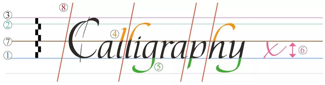
- Base line: The writing line upon which the body of a letter sits
- Ascender line: The guideline which sets the height of an ascending letter
- Cap line: The guideline which sets the height of a capital letter
- Ascender: The portion of a letter that is between the 7 x-line and the 2 ascender line
- Descender: The portion of a letter that lies below the 1 base line
- x-height: The height of a letter or the portion the script that is located between the 1 base line and the 2 ascender line (the height of the lower case „x“)
- x-line: The guideline showing correct position for upper limit of the 6 x-height
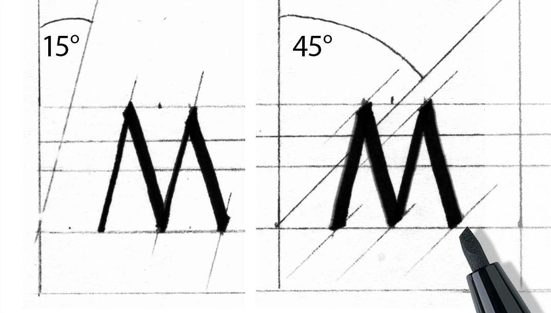
- Slant line: The guideline showing the correct slant
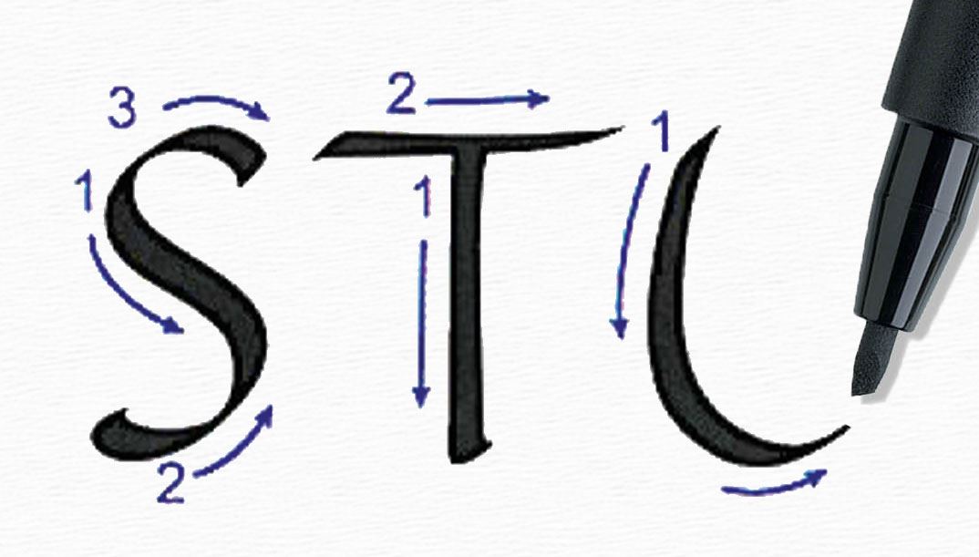
Slant: The slope of a letter, measured from the vertical.
Nib width: The width of the writing tool. A letter written at 4 nib widths high will appear twice as heavy as one written at 8 nib widths using the same writing tool.
Hairline: A very thin line.
Pen Angle: The angle at which the nib meets the paper, relative to the base line.
Downstroke: A stroke directed downwards towards the base line or descender line.
Cross bar: Horizontal stroke forming part of a letter (such as the „t“ or „H“).
WHAT EQUIPMENTS DO I NEED FOR MODERN CALLIGRAPHY
Now that we know the basic difference between traditional calligraphy and modern calligraphy, it’s time to review some of the essential items that we will need. Modern calligraphy can be practiced with a whole variety of different tools, such as

INK AND PAPER
Read moreINK AND PAPERS
Ink
Sumi Ink is an easy-to-use ink that is great for getting started. I found a big bottle at Michaels (still haven’t finished it!), but it is also easy to find different brands online.
Paper
Many of the cartridge-filled pens recommended in this guide are fountain pens. They can be filled with cartridges or paired with a converter for access to hundreds of different bottled inks. However, make sure to fill these pens with an ink made specifically for fountain pens. India and calligraphy inks are formulated with binders that will clog the feed and nib, which will ruin the pen. Learn more about fountain pen inks in our beginner's guide.
Quality Calligraphy Paper
For General Pointed Pen Calligraphy Practice
For pointed pen calligraphy, you need a minimally absorbent paper with no texture on the surface and a minimal paper weight of 100gsm
However, choosing paper for calligraphy projects and practice may not be cut and dry. To make sure your tools match your paper check out my paper comparison post here: The Best Paper for Calligraphy
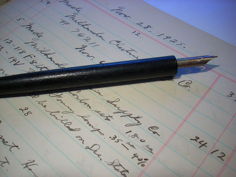
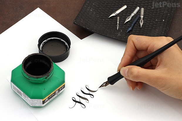
DEEP PENS
Read moreDEEP PENS
Deep pens
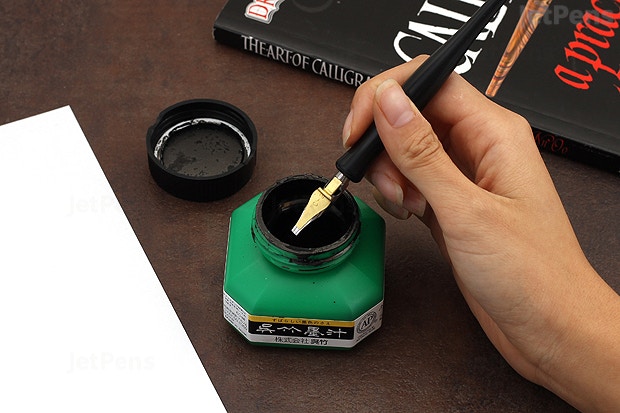
With dip pens, the possibilities are endless. It is better to use calligraphy inks because they are more viscous than fountain pen inks and will cling to the nib better. This prevents the ink from sliding off the nib and creating unsightly blobs. Some calligraphy inks come in different colors or even with glitter mixed in, which can add texture and dimension to your calligraphy. Fountain pen inks can be used with dip pens, though calligraphers may find it helpful to thicken the ink.
When choosing paper, forgo your regular printer paper. Calligraphy pens generally dispense more ink, and with low quality paper, bleeding is more likely to happen. Choose something that is higher quality so it will not bleed or feather. If you are not sure what kind of paper is suitable for calligraphy, look for paper that is fountain pen friendly.
BRUSH PENS
Read moreBRUSH PENS
Brush pen
However, if you are a total beginner i would advise you start practicing with a brush pen simply because it is much easier to learn how to work with compared to the traditional dip pen. Don’t worry, I am also going to recommend specific products so you don’t have to waste time looking around for them.
The reason for including brush pens as a separate category here is because brush lettering (aka brush calligraphy) has become extremely popular in recent years.
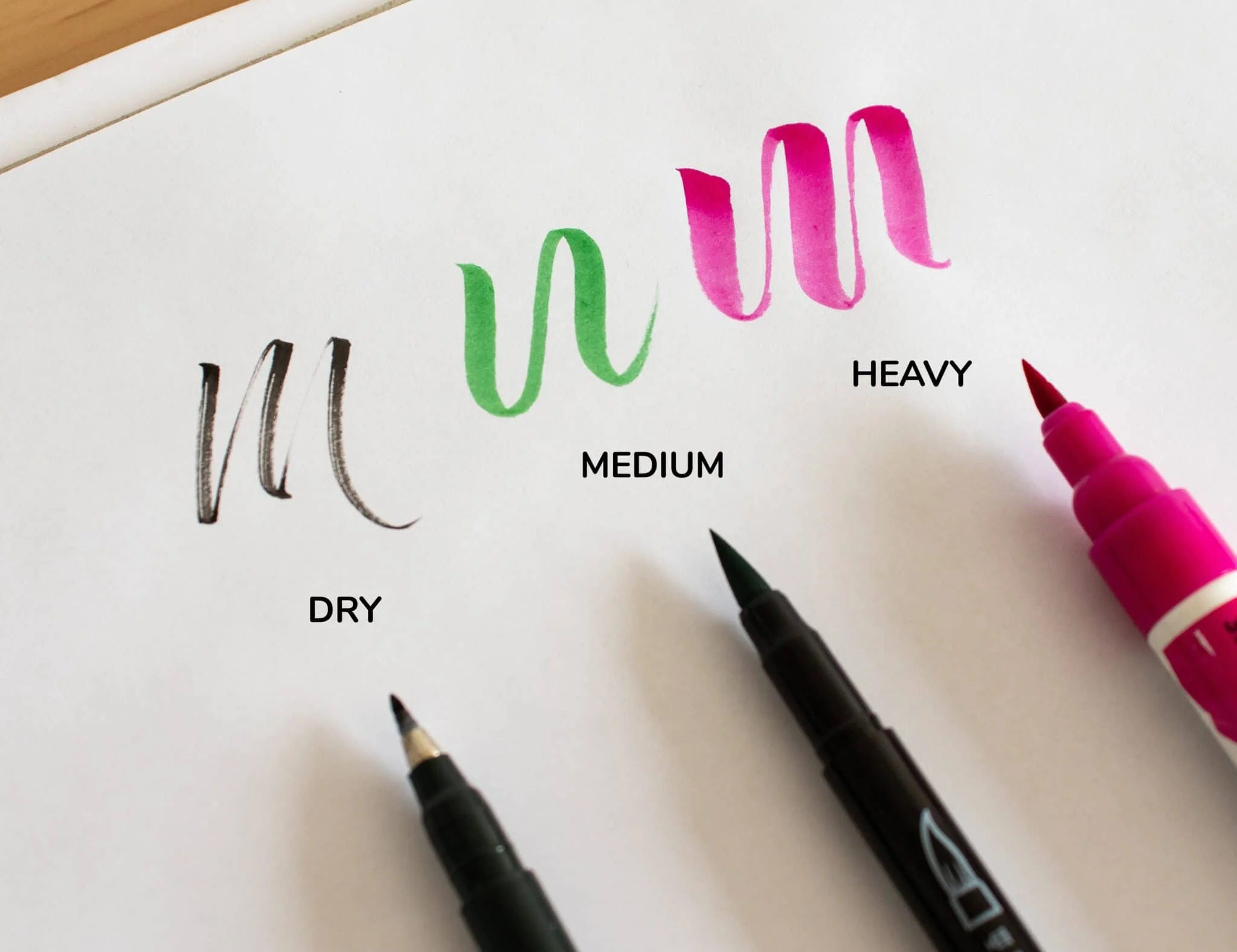
There are many different brush pens available on the market today, and they all differ from each other.
They differ in aspects such as –
- Size
- Nib flexibility
- Ink flow
- Colors, etc.
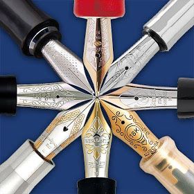
NIBS
Read moreNIBS
New nibs are dirrrty
Brand-new nibs do come with a coating that keeps them from rusting while in storage. Which is great! Unfortunately, the coating also keeps ink from sticking properly to the nib. Which is less great… Fortunately, cleaning your new nibs is easy! There are tons of different ways…
Nibs have a lifespan
Even though they’re made of pretty tough metal, nibs still wear out with use! It’s impossible to give you an average lifespan it varies widely depending on the TYPE of nib, how OFTEN you use it and HOW you use it.
Some nibs are dubs!
Nibs aren’t always manufactured perfectly. Depending on the brand and style, you can often get brand-new ones that just feel “off.” If your nib just refuses to release the ink, or feels excessively scratchy, or dumps ink more frequently than before… it might be a dud! If you’re serious about calligraphy, it’s best to keep several nibs on hand so you can change them out and save yourself the frustration.
PENCILS
Read morePENCIALS
Pencils
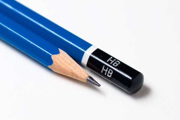
This tool is such an essential part of ANY lettering/calligraphy toolbox. In modern calligraphy we are mainly using the pencil to sketch out rough concepts, create guidelines and for those who are on a budget you can even practice calligraphy with it. When it comes to the pencil, I would recommend a simple HB pencil or a mechanical pencil like the Staedtler Mars 780 Technical Mechanical Pencil I am also going to recommend specific products so you don’t have to waste time looking around for them.
How to Choose a Pencil
Pencil calligraphy can be created with a variety of pencils, but not all pencils are up to the challenge. Pencils graded HB, B, or 2B are best because they have a fairly soft graphite core. If you’re not sure what grade your pencil is, go ahead and try to use it anyway!
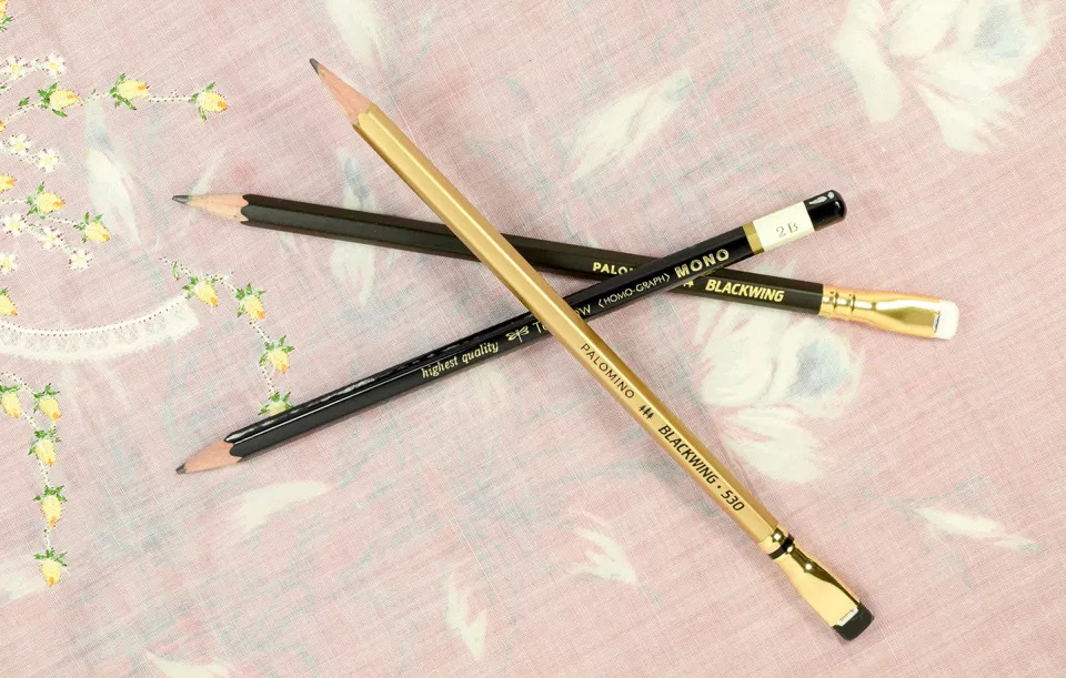
Regardless of which pencil you use, make sure it is not a mechanical pencil! Pencils that you have to manually sharpen are best for creating pencil calligraphy
MARKERS
Read moreMARKERS
Markers
Mostly used for creating Faux Calligraphy and other styles of modern calligraphy, these markers can indeed be a great addition to your lettering. Adding effects, patterns, colors, pretty much anything that comes to your mind, is one of the benefits when working with modern calligraphy.
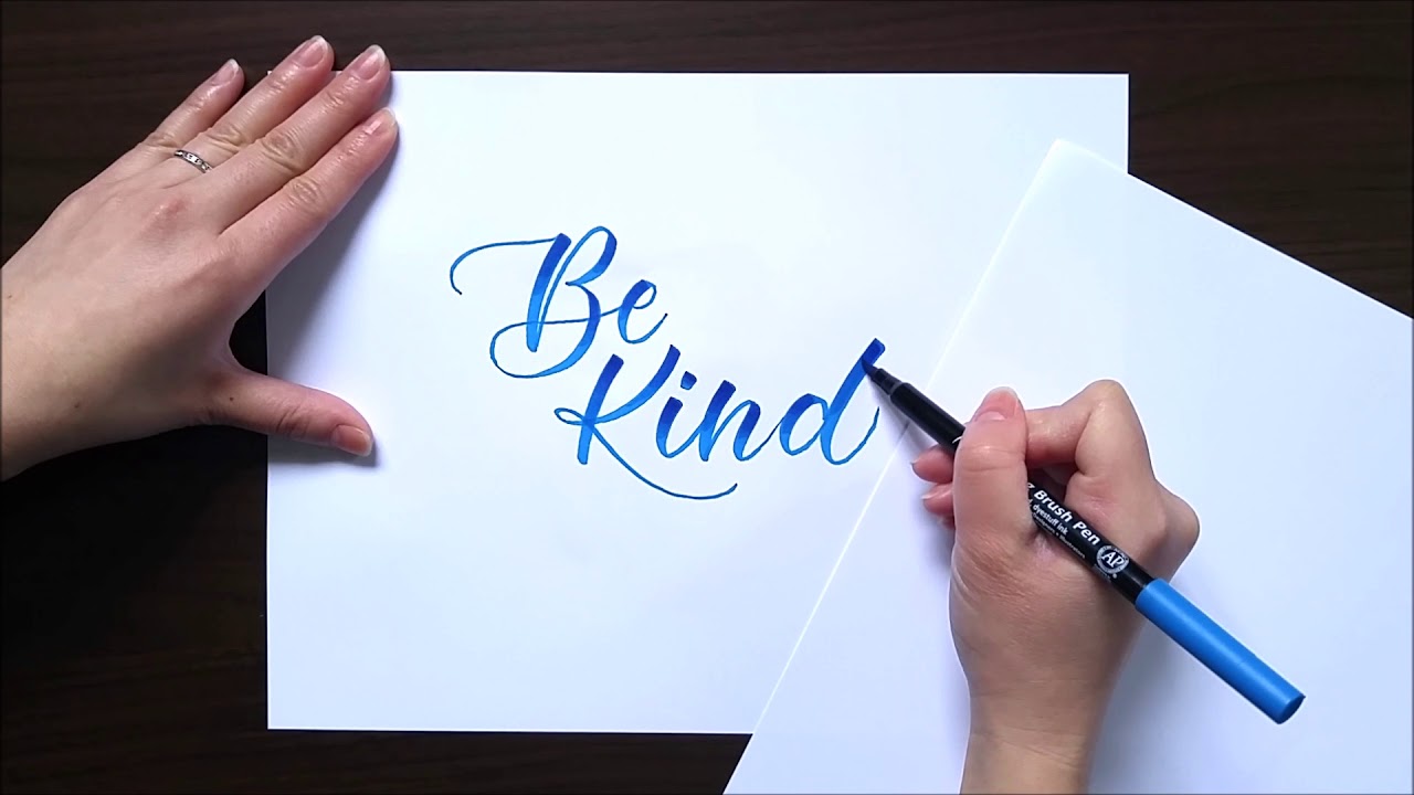
How to Write Marker/Crayola Calligraphy
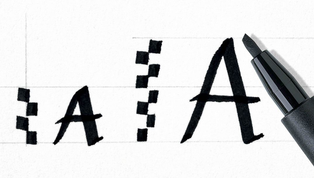
When you write calligraphy with any markers — Crayola or otherwise — you’re looking to make thin upstrokes and thick downstrokes. Upstrokes occur when you push your pen from bottom to top to make part of a letter. Downstrokes occur when you pull your pen from top to bottom to make part of a letter. I find that it’s easiest to make upstrokes when the pen is somewhat upright, as pictured below. Make sure you don’t apply much pressure to the marker’s tip, and gently push upward.
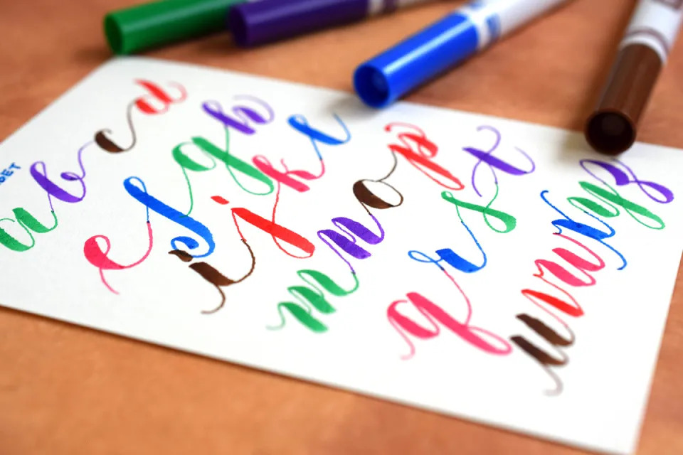
To make a downstroke, you’ll slightly rotate the pen to the right (or to the left, if you’re left-handed). Apply firm pressure to the marker, pulling down. That should result in a nice, thick stroke